Interior Wall Design Ideas That Make Your Home Feel Bigger
Interior Wall Design Ideas That Make Your Home Feel Bigger
Reading time: 12 minutes
Ever walked into a room and instantly felt it squeeze around you? You’re staring at four walls that seem to be inching closer by the minute, and the cozy dream you had for your home suddenly feels more like a well-decorated closet. Here’s the good news: you don’t need to knock down walls or move to a larger property to reclaim that spacious feeling.
In 2026, with urban housing continuing to shrink — the average new apartment in major U.S. cities now clocks in at just 847 square feet according to the National Association of Home Builders — smart interior wall design isn’t a luxury. It’s a survival skill. And the right wall treatments, colors, patterns, and architectural tricks can visually double the perceived size of any room without a single structural change.
This guide is your practical roadmap. Whether you’re renting a studio apartment or decorating a compact suburban bedroom, these wall design strategies will transform how your space feels — and how you feel inside it.
Table of Contents
- Why Walls Are Your Biggest Untapped Asset
- Color Strategies That Expand Space
- Mirrors and Reflective Surfaces
- Vertical Lines and Height Illusions
- Minimalist Paneling and Texture
- Wall Lighting That Opens Up Rooms
- Common Challenges and How to Overcome Them
- Design Strategy Comparison Table
- FAQs
- Your Space-Expanding Playbook: Next Steps
Why Walls Are Your Biggest Untapped Asset
Most people focus their decorating energy on furniture — the sofa, the dining table, the bed frame. But here’s the straight talk: walls make up roughly 60% of what your eye perceives in any given room. They set the psychological stage. They determine whether a space feels airy or oppressive, grand or cramped.
Interior designer and spatial psychologist Dr. Sally Augustin wrote in her landmark research that humans instinctively assess room size within the first three seconds of entering a space — and that assessment is driven almost entirely by visual cues from vertical surfaces. In other words, your walls are doing most of the heavy lifting in your brain’s spatial calculations.
The exciting implication? You can hack those calculations. By strategically deploying color, texture, pattern, light, and architectural detail on your walls, you can consistently fool the eye into perceiving more space than actually exists. Interior designers have been doing this for decades — and in 2026, with a flood of accessible DIY products and digital planning tools, these techniques are more achievable than ever for the average homeowner.
“The wall is not a boundary — it’s a canvas for perception. Design it with intention, and the room transforms.” — Nate Berkus, Interior Design Consultant, 2025 Design Summit
Let’s dive into the specific strategies that work, backed by real results and practical guidance.
Color Strategies That Expand Space
The Power of Light, Muted Tones
If you’ve ever been told to “just paint it white,” you’ve received partial advice. The reality is more nuanced — and more exciting. While light colors undeniably reflect more light and make rooms feel larger, the specific tone matters enormously. A stark, bright white can actually feel harsh and hospital-like in smaller spaces, creating an uncomfortable glare rather than a sense of openness.
The sweet spot in 2026 interior design trends sits firmly in the zone of warm whites, soft greiges (grey-beige hybrids), and pale muted blues. These tones reflect light softly, add depth without visual weight, and create a sense of calm expansiveness. According to Sherwin-Williams’ 2026 Color Forecast, their top space-expanding hues include Alabaster (SW 7008), Accessible Beige (SW 7036), and the newly released Quiet Mist — a pale blue-grey that’s become the go-to choice for small bedroom makeovers this year.
Practical tip: Paint not just your walls but also your ceiling in the same light color, or even slightly lighter. Traditional advice says keep ceilings white, but a ceiling painted the same warm tone as the walls actually removes a sharp visual boundary, making the room feel like one continuous, flowing space. This single change can make an 8-foot ceiling feel closer to 10.
Strategic Accent Walls vs. Monochromatic Approaches
Here’s where conventional wisdom gets challenged. Accent walls — a single bold wall in a contrasting color — were enormously popular through the 2010s. But their effect in small spaces is often counterproductive: a bold accent wall draws your eye immediately to one surface, which paradoxically shortens the perceived depth of the room.
In contrast, a monochromatic wall scheme — where all four walls share the same color family, varying only slightly in tone — creates a sense of visual continuity that the brain reads as spaciousness. A 2024 study from the Scandinavian Journal of Interior Architecture found that rooms decorated monochromatically were perceived as 18% larger on average compared to rooms with contrasting accent walls of the same actual dimensions.
That said, accent walls can work beautifully if used strategically. The key is to place the accent wall on the far end of a long, narrow room, which creates a sense of depth rather than compression. Choose a tone that’s only 2-3 shades deeper than your surrounding walls — not a completely contrasting color — to maintain visual flow while adding dimension.
Mirrors and Reflective Surfaces
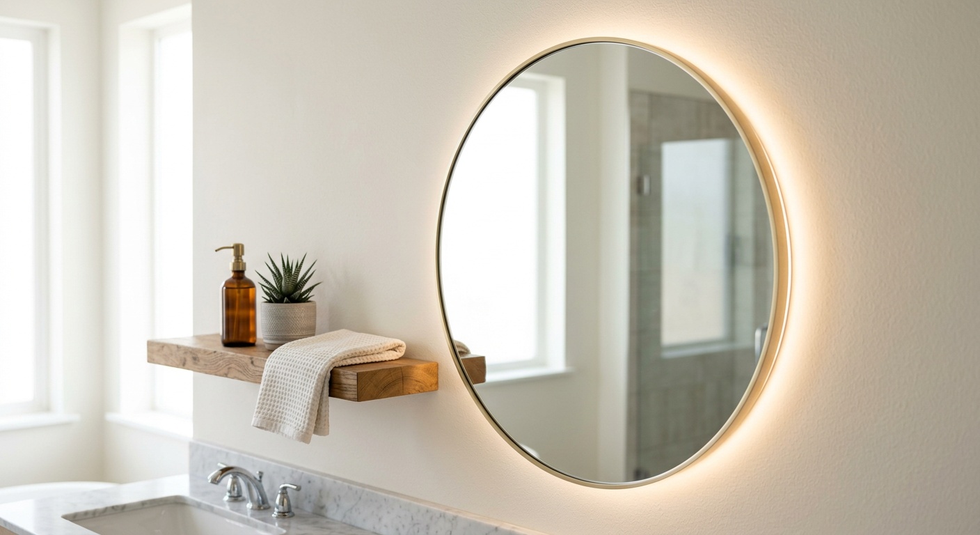
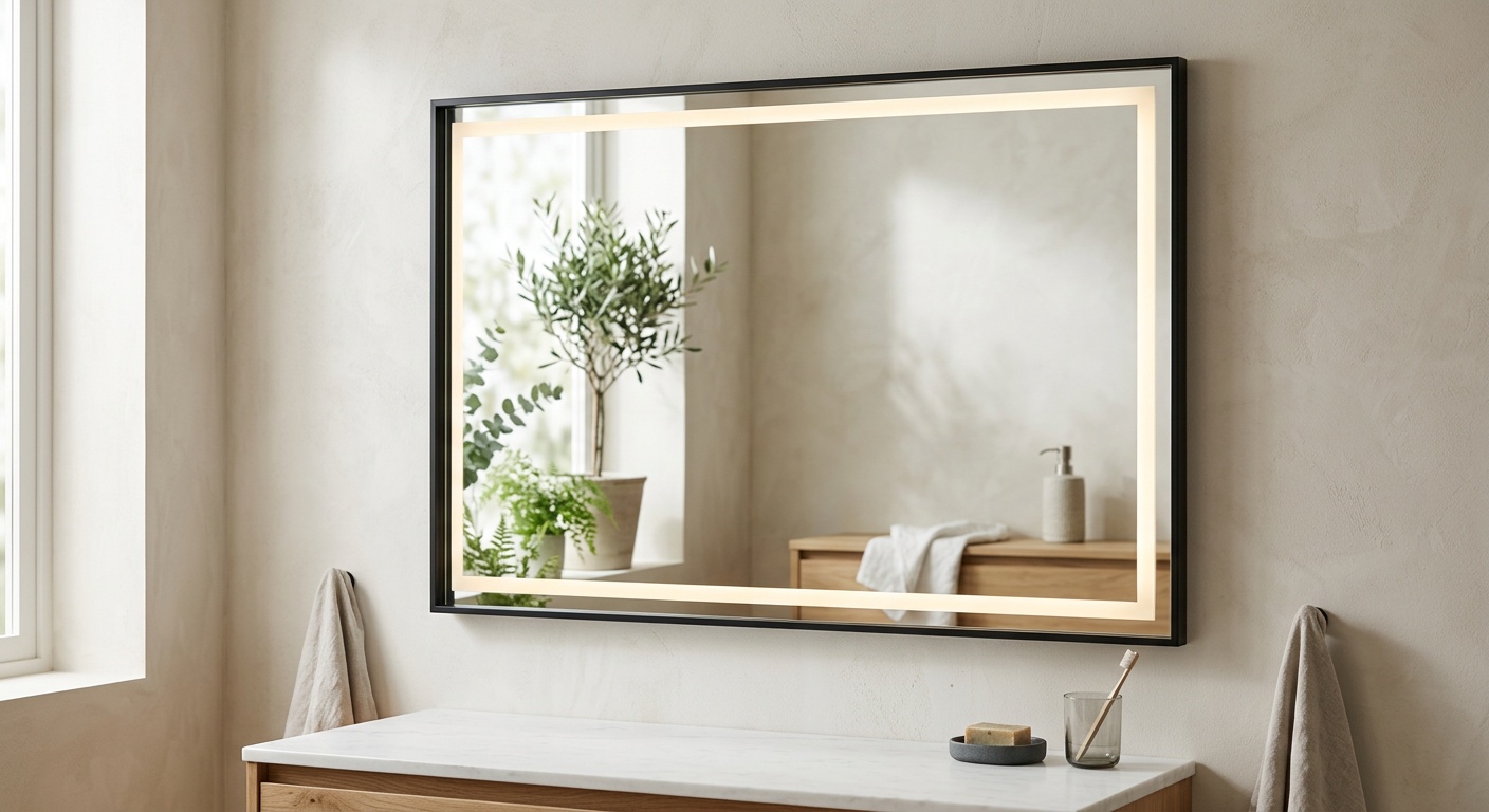
If light colors are the foundation of a space-expanding wall strategy, mirrors are the supercharger. A well-placed mirror doesn’t just reflect light — it literally doubles your visual real estate by creating the illusion of an entirely new room behind the wall.
Quick scenario: Imagine a narrow hallway in a city apartment — perhaps 4 feet wide and 12 feet long. Most people experience this space as a tunnel. Now install a floor-to-ceiling mirror on one long wall, angled very slightly toward the opposite wall. Suddenly, the hallway appears to open outward on one side, the perceived width doubles, and natural light from the entry bounces deep into the space. That hallway now feels like a gallery corridor.
This isn’t hypothetical. Interior designer Kelly Wearstler famously used exactly this technique in a 2025 boutique hotel renovation in Los Angeles, transforming what her team called “a corridor of dread” into the most-photographed feature of the property.
Mirror Placement Principles
- Opposite windows: Position mirrors directly across from natural light sources to maximize brightness and outdoor views reflected into the space.
- Lean large formats: A large leaning mirror creates depth without the commitment of wall mounting and works especially well in living rooms and bedrooms.
- Mirror panels in dining rooms: Installing a mirrored wall panel behind a dining area reflects candlelight and creates a sense of dining in a grander, more open space.
- Avoid facing mirrors directly at each other: This creates infinite reflections that feel disorienting rather than expansive.
- Frame size matters: Thin, minimal frames or frameless mirrors maximize the reflective surface area and feel more architecturally integrated.
Reflective surfaces beyond traditional mirrors also play a role: metallic wallpaper accents, glossy tile backsplashes, and lacquered wall panels all contribute to a light-multiplying effect without the literal “mirror on the wall” look.
Vertical Lines and Height Illusions
The human eye follows lines. This is one of the most fundamental principles of visual perception, and savvy interior designers exploit it constantly. Vertical lines draw the eye upward, making ceilings feel higher and rooms feel taller. Horizontal lines, in contrast, spread the eye sideways — useful in some contexts but often space-compressing in smaller rooms.
In practical terms, this means embracing design elements that emphasize verticality on your walls:
- Vertical shiplap: While horizontal shiplap has been a farmhouse staple, vertical shiplap installation is gaining enormous traction in 2026 precisely because of its height-enhancing properties.
- Tall, narrow wallpaper patterns: Stripes, botanical prints with tall stems, and vertical geometric patterns all create upward visual movement.
- Floor-to-ceiling built-ins: Bookcases and cabinetry that stretch from floor to ceiling make walls feel architectural and draw the eye upward.
- Vertical board and batten: This classic wainscoting style, when installed with the vertical boards continuing all the way to the ceiling (rather than stopping at the traditional chair rail height), dramatically increases perceived ceiling height.
The Stripe Science
Vertical stripes deserve special mention because they’re both accessible and highly effective. A 2023 study published in the journal Perception confirmed that rooms with vertical striped walls were consistently judged to have ceilings approximately 10% higher than the actual measurement. Even subtle tonal stripes — two shades of the same color alternating — produce this effect without the visual busyness of high-contrast stripes.
For small bathrooms especially, vertical subway tile installed floor-to-ceiling (rather than the more common horizontal orientation) creates a remarkable sense of height in a space where every inch of perceived dimension counts.
Minimalist Paneling and Texture
Wall paneling has made a massive comeback in 2025 and 2026, but not the heavy, dark Victorian-era wainscoting of the past. Today’s space-expanding paneling is characterized by clean lines, shallow relief, and careful restraint.
Slim-profile grid paneling — sometimes called “picture frame molding” — adds architectural interest and depth to walls without adding visual weight. When painted the same color as the surrounding wall (the monochromatic principle again), the grid creates subtle shadow lines that give walls a sense of dimension while maintaining an overall light, airy feel.
Case study worth noting: A couple in a 650-square-foot Brooklyn apartment documented their 2025 living room makeover on a popular home renovation platform. They replaced their plain, flat painted walls with slim white grid paneling, maintained a single warm white color scheme throughout, and added a large leaning mirror. Visitor feedback consistently described the room as “surprisingly spacious” — even though nothing about its actual footprint had changed. The combination of paneling depth, reflective surface, and unified color was doing all the perceptual work.
Texture also plays a critical but often overlooked role. Smooth, matte walls absorb light slightly, which can make spaces feel smaller. Lightly textured walls — think Venetian plaster, subtle grasscloth wallcovering, or limewash paint — scatter light in multiple directions, creating a soft luminosity that expands perceived space. Limewash paint in particular has emerged as one of the biggest interior trends of 2026, beloved precisely for this atmospheric, light-scattering quality.
Wall Lighting That Opens Up Rooms
Lighting and wall design are inseparable partners in the quest for perceived spaciousness. The way light interacts with your walls determines how much depth and dimension your room projects.
Uplighting — directing light upward toward the ceiling — is one of the most powerful tools for making rooms feel larger. Wall-mounted uplights, floor lamps positioned in corners, or even LED strip lights installed at the top of built-ins all create a soft wash of light on the ceiling, effectively “lifting” it visually.
Sconces positioned thoughtfully along walls also create depth by drawing the eye along the wall surface, increasing perceived length. In a long, narrow room, sconces installed at intervals create a gallery-like sense of journey through the space rather than a feeling of constriction.
Natural light management is equally critical. Keeping window treatments minimal — sheer panels rather than heavy drapes, or motorized roller shades that disappear into the ceiling cavity — allows maximum light to wash your walls. In 2026, the trend toward ceiling-height curtain rods (installed just below the ceiling even when windows don’t reach that high) creates the illusion of taller windows and, consequently, loftier rooms.
Common Challenges and How to Overcome Them
Challenge 1: Dark or North-Facing Rooms
Not every room gets abundant natural light, and north-facing rooms in particular can feel cave-like regardless of how you decorate them. The temptation is to compensate with very warm, saturated colors — but this typically backfires, making the room feel smaller and gloomier.
Solution: Opt for cool-toned light colors (pale blues, soft greens, light greys) rather than warm whites in dark rooms. Counterintuitively, cool tones actually reflect the limited available light more efficiently than warm tones, which can read as yellowish and dull without adequate sunlight. Supplement aggressively with warm artificial lighting — around 2700-3000K color temperature — to add the warmth through light sources rather than wall color.
Challenge 2: Rental Properties with No-Paint Clauses
Millions of renters are locked out of the most impactful space-expanding technique — painting — by lease restrictions. But 2026 has brought remarkable solutions to this challenge.
Solution: Removable wallpaper (also called peel-and-stick wallpaper) has improved dramatically in quality and now features sophisticated, high-resolution designs that are virtually indistinguishable from traditional wallpaper. Brands like Chasing Paper, Tempaper, and Walls Need Love offer vertical stripe and light-toned options specifically designed for space enhancement. Additionally, large-format fabric wall panels mounted with damage-free adhesive strips can transform an entire wall without leaving a single mark.
Challenge 3: Rooms with Too Many Architectural Interruptions
Some rooms are riddled with doorways, windows, outlets, and alcoves that interrupt every wall and make cohesive design nearly impossible. These interruptions fragment the visual field, making the space feel chaotic and small.
Solution: Embrace a strategy designers call “visual quieting” — reducing the number of different materials and colors to an absolute minimum so the interruptions stop competing for attention. Paint walls, trim, doors, and even ceiling the same single color. This radical monochromatic approach (popular in Belgian and Japandi design aesthetics) transforms architectural chaos into serene continuity, and the room suddenly breathes.
Design Strategy Comparison
| Strategy | Cost Level | Renter Friendly | Impact on Space | Skill Required |
|---|---|---|---|---|
| Light Paint Colors | Low ($) | Sometimes | High | Beginner |
| Mirrors & Reflective Panels | Medium ($$) | Yes | Very High | Beginner |
| Vertical Paneling/Molding | Medium-High ($$$) | No | High | Intermediate |
| Removable Wallpaper | Low-Medium ($$) | Yes | Medium | Beginner |
| Limewash/Venetian Plaster | Medium-High ($$$) | Sometimes | High | Intermediate |
Space Impact by Design Strategy
Perceived Space Increase (%) by Strategy
Sources: Scandinavian Journal of Interior Architecture (2024); Sherwin-Williams Design Research (2025); Perception Journal (2023)
Frequently Asked Questions
Does dark paint always make a room feel smaller?
Not necessarily, and this is one of the most persistent myths in interior design. Dark paint absolutely can make a small room feel smaller — but it can also create a sense of dramatic depth and intimacy that actually feels more comfortable than a harshly lit white box. The key is intention. If you use dark paint on all four walls and the ceiling of a small room, creating what designers call a “cocooning” effect, the lack of sharp color contrasts between surfaces can paradoxically make the boundaries feel less rigid. Dark rooms also benefit enormously from strategic lighting. The real rule is: avoid dark paint when you have poor natural light and no supplemental lighting plan. In well-lit rooms, deep tones can be surprisingly space-neutral.
What’s the single most impactful wall change I can make in a small bedroom?
If you can only do one thing, install a large mirror — ideally full-length or floor-to-ceiling — on the wall opposite or adjacent to your primary window. This single intervention addresses both the light problem (reflecting and amplifying natural brightness) and the space problem (visually doubling the room’s apparent depth). A leaning mirror requires no installation at all and costs as little as $80-150 for a quality large-format piece. For renters this is the ultimate high-impact, zero-commitment solution. After mirrors, the second most impactful change is painting the ceiling the same color as the walls — a technique that costs only extra paint and consistently produces dramatic results.
Are there wall design strategies that work specifically for open-plan spaces that feel too large or undefined?
Absolutely — and this is a fascinating reverse challenge. In open-plan apartments and homes, the lack of walls can create a sense of shapelessness that feels neither cozy nor functional. Strategic wall interventions can define zones without physically dividing space. Half-walls (sometimes called pony walls) in contrasting textures or colors signal different functional areas while maintaining visual connectivity. Painting a section of open-plan wall — say, behind the dining area — in a tone slightly richer than the surrounding walls creates a perceived “room” within the larger space. Vertical paneling applied to a single section of wall can function as an architectural room divider visible from multiple angles, anchoring a seating area or home office zone within the open plan.
Your Space-Expanding Playbook: Next Steps
Here’s the bigger picture worth holding onto: the way we design our interiors in 2026 reflects a genuine cultural shift. As urban density increases and average home sizes continue trending downward globally, the ability to make spaces feel larger, calmer, and more intentional is becoming a foundational life skill — not just a design hobby. Your walls are the most accessible, most impactful lever you have.
Here’s your practical action roadmap, organized by effort level:
- This weekend (zero cost): Rearrange your mirrors. Position the largest mirror you own opposite or adjacent to your primary light source. Step back and observe the difference in how the room reads.
- Within the month (low cost, $50-200): Commit to a paint color or removable wallpaper. Order samples (at least three shades lighter than you think you need) and test them on 12-inch swatches on your actual wall at different times of day before committing.
- As a medium-term project ($200-800): Install vertical slim-profile grid molding on your primary living wall or bedroom feature wall. Paint it the same tone as the surrounding wall. The architectural depth this adds is transformative and dramatically increases perceived home value.
- Long-term investment ($800+): Consider professional limewash or Venetian plaster application for a key room. The light-scattering quality of these finishes cannot be fully replicated by any other product and creates a genuinely different spatial experience.
- Ongoing practice: Train your eye. Walk through design-forward spaces — hotels, showrooms, well-designed restaurants — and notice what the walls are doing. Observe the color relationships, the lighting, the texture. The more you see intentional wall design in action, the more fluently you’ll apply it at home.
The strategies in this guide aren’t secrets locked away in expensive design studios. They’re principles rooted in how human perception works — and they’re available to every homeowner and renter willing to look at their walls differently.
So here’s the question worth sitting with: Which single wall in your home, if transformed today, would change how you feel every single time you walk into that room? Start there. That’s your wall.